This article originally appeared on the Prime Design Solutions website.
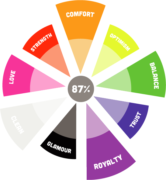
The use of color is of great importance to anyone that works in advertising. We all know how important color schemes are to brand consistency and we’re also quite cognizant of the messages certain colors send. The power of color lies in its ability to communicate non-verbally. In fact, up to 87% of sensory perception comes to us through color. To marketers, that kind of power deserves a close look.
How exact of a science is the study of color and behavior?
The study of color in psychology and in marketing can be controversial — it’s fairly subjective. Perception of color is dependent upon personal experiences, but some things are ingrained in our culture:
- We’ve been trained that red means stop, and green means go.
- When we think of ecology, we think green.
- Baby boys are associated with blue, and baby girls with pink.
Some colors can send mixed messages, depending on the observer. When looking at a tan color scheme, one person might think “warm and cozy” while another thinks “boring and drab.”
What are some common generalizations about specific colors?
Colors do influence feelings and perception. Some of the most common generalizations are:
Blue is trustworthy, implies communication and serenity. Some examples of brands that use this color in their branding are:
- Dell
- Direct TV
- PayPal
Green is peaceful or healthy, and also very connected to nature.
- Holiday Inn
- John Deere
- BP
- The symbol for recycling
Red is exciting, emphasizing energy and vibrancy.
- Coca-Cola
- CNN
- Target
A great article about how brands utilize color in marketing can be found here. An interesting website about color is here.
Do colors influence our behavior?
You can’t make a button a certain color to guarantee a person will push it, for example, but there’s no doubt that colors can influence general feelings and therefore have a subtle influence on behavior. Red can impact feelings of hunger, while yellow can encourage feelings of movement. With that in mind, it’s not surprising that McDonald’s logo and interior decor is red and yellow — they want you to eat, then leave quickly. Other examples of connotations associated with color that can benefit marketers include:
- Green stimulates harmony and encourages balance.
- Orange creates a sense of anxiety that draws in the impulsive buyers.
- Purple encourages creativity and problem solving.
- Blue curbs appetite, creates a sense of security and stimulates productivity.
How is color important in relation to branding?
Branding includes your company’s name, sign, symbol and design — everything that is intended to identify a company’s products or services. In short, branding is the “identity or idea of the company.” Designers and marketers try to harness the power of color in branding, because color has a powerful psychological impact on people’s behaviors and decisions.
Color influences branding because it is an instantaneous, effective method for conveying meaning without words. Recognizable brands rely on color as the key factor for instant recognition. Take Apple, for example — their white or grey color scheme is very slick, clean, and implies high-tech. The statistics on color and brands are striking:
- Color increases brand recognition by 80%. (Consider how quickly you recognize a sports team by color).
- 60% of the time people decide whether they are attracted to a message by the color alone.
Rules about color usage
Bearing in mind that rules are made to be broken, there are some general guidelines that can be useful when considering color in marketing. These include:
Color schemes generally have three major components: background color, base color and accent color, and are proportioned according to the 60-30-10 rule. Accent colors (10%) are used to attract attention or for calls to action, and are usually the boldest color — it’s important not to use this color too many times or else it defeats the purpose. This color should be used for things like buttons, tabs, or places where you want people to click on a website, or on things you especially want people to see in print ads or direct mail. The background color should be about 60% of the whole, while your base color is about 30%.
The effectiveness of specific colors is generally tied to the color scheme as a whole. There is no rule that states that red buttons get clicked more than blue buttons — instead, the click rate is influenced by how effective the button color is in the entire color scheme. Color schemes should allow for high contrast for action items like buttons, links or tabs.
Due to our lifelong training of our brain to see certain colors in certain ways, we should look at popular associations with particular colors when selecting a color palette. This is where the color associations we’ve been discussing come into play — such as the idea that pink is feminine, red is danger, or gray is depressing. Consider contrast in your color scheme, as contrast reduces eyestrain and encourages readers to focus attention on specific items. Vibrancy is also an important factor, as choosing bright colors can lead users to feel more energetic, which in turn warrants better responses and reactions. On the other hand, websites that contain a lot of information benefit from the use of a darker color scheme, because this makes it easier for readers to process the information.
Conclusion
Color should be considered in anything that is used to communicate visually with your customers. This includes your corporate branding and product packaging, as well as advertising materials and retail or corporate space. Being sensitive to the subtle messages your palette is sending can help you get more impact out of your marketing efforts.
