This article originally appeared on the Prime Design Solutions website.
Table of contents
Related articles
The statistics on mobile and tablet use continue to skyrocket. People are spending more time on their mobile devices than ever – mobile usage is now at 60% of time spent online, vs. 40% of desktop-based activity. Some 20% of millennials aren’t using desktop at all.
These statistics and many others present a compelling case for why your website must be mobile-friendly. But in case that’s not enough to convince you – the search engine giant Google continues to emphasize the importance of mobile. Here are two of the most important ways, and what they mean for your business.
Google AdWords
Google AdWords are one of the most popular forms of digital advertising – in fact, Google says its search and advertising tools drove $165 billion of economic activity for over a million organizations (including businesses, publishers and nonprofits) last year alone.
With AdWords, you place text-only ads that link to your website based on certain keywords that people would likely use if they were trying to find the products or services your business offers. These ads then appear in Google search engine results pages (SERPs) first – above the “native results.” They are “pay-per-click,” meaning that the advertiser is only charged when someone clicks on the ad.
The premise is simple, but the execution can be complicated. It’s not always easy to choose keywords that are appropriate to your business but specific enough that you’ll only get relevant traffic, for starters. When you place an ad, you “bid” on keywords, letting Google know how much you’re willing to pay for your ad to be included. Sometimes the most popular keywords are also the most competitive and expensive, making it cost-prohibitive to get any traffic at all.
But like everything else in the digital world, AdWords has been profoundly affected by the increasing shift to mobile and tablet computers. Google has responded by making some major changes in AdWords. These include:
- Elimination of AdWords ads on the right side of SERPs. Previously, when you purchased ads, you had the option of ads that would be placed at the top of SERPs (more expensive), and/or in a column on the right side of the page (less expensive). But mobile and tablet screen sizes are too small to accommodate the right column, so Google has eliminated this option for AdWords ad purchasers altogether. This is understandable, given the parameters of the media environment – but an unfortunate side effect is that keyword bidding has been driven much higher, because there are fewer ads available for purchase. Instead, just four ads will appear above SERPs, and three ads below SERPs.
- Campaigns that only target mobile or tablet. Google has also increased the flexibility of AdWords purchases, so that it’s possible to be more specific about which devices you want to target – for example, if you’re targeting by location and are trying to increase foot traffic to your physical location, mobile ads are a better choice for you.
The bottom line is that AdWords campaigns are not as affordable as they once were. Contact us if you need help creating or refining a digital advertising strategy.
Search Engine Results Pages changes
Back in April 2015, Google announced that websites that were not mobile friendly would be penalized in their placement on SERPs. Essentially, what that meant is that regardless of the relevance of your site’s content, it would appear lower in SERP results if the site was not optimized for mobile. This makes perfect sense, as Google’s goal is to show you the best results for your query – and if you’re searching on a mobile phone, a non-optimized site isn’t going to be as useful as a responsive one.
Google is in the process of taking this a step further. First, some background – when you perform a Google search, you’re actually searching an index Google creates from all the websites currently published. This search index makes it possible for Google to search faster and more efficiently – it can be compared to searching a library’s catalog versus having to flip through every book to find what you’re looking for. Here’s the important point — Google has let it be known that the mobile search index will be more up-to-date than the desktop search index. The change is expected to be implemented in the next few months.
That means that mobile and desktop users could potentially see different results when they perform the exact same search, but the implications beyond that are unclear. It’s not yet known if Google will exclude or further penalize websites that aren’t mobile-friendly from the mobile search index, or how different the two indexes will be.
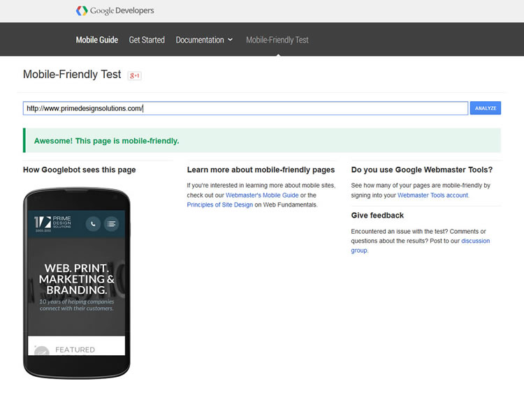
But it is reasonable to assume that if your site isn’t mobile-friendly now, you’re at risk of putting your business at an even bigger disadvantage as the changes are implemented. You can use this tool provided by Google to make sure your site is mobile-friendly – if not, now is a great time to consider a website upgrade. Give us a call at (814) 248-3180 for a consultation!
